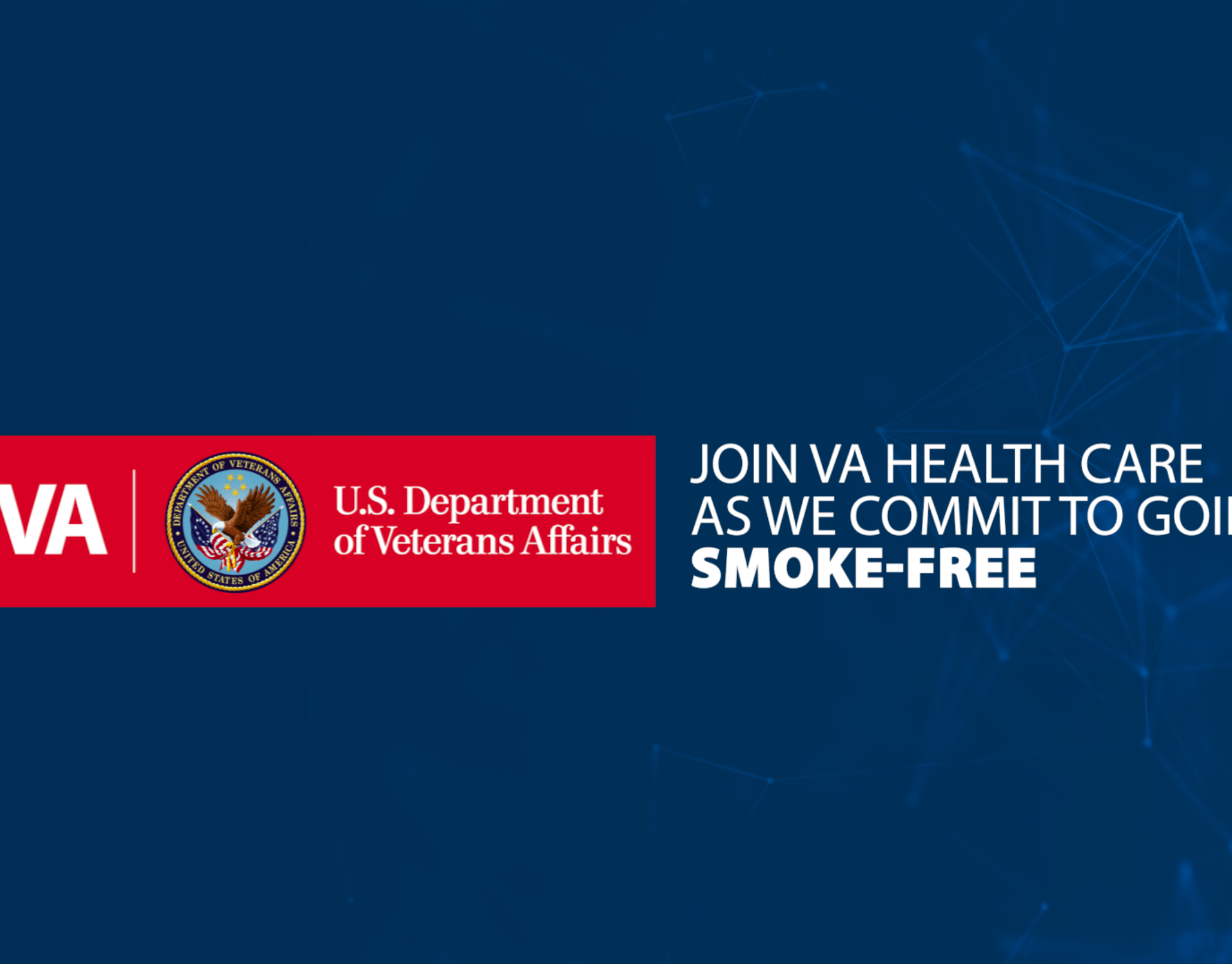
This publication serves as an important communication bridge across departments — requiring clarity, visual hierarchy, and consistency for an audience with diverse needs.
Client Challenge
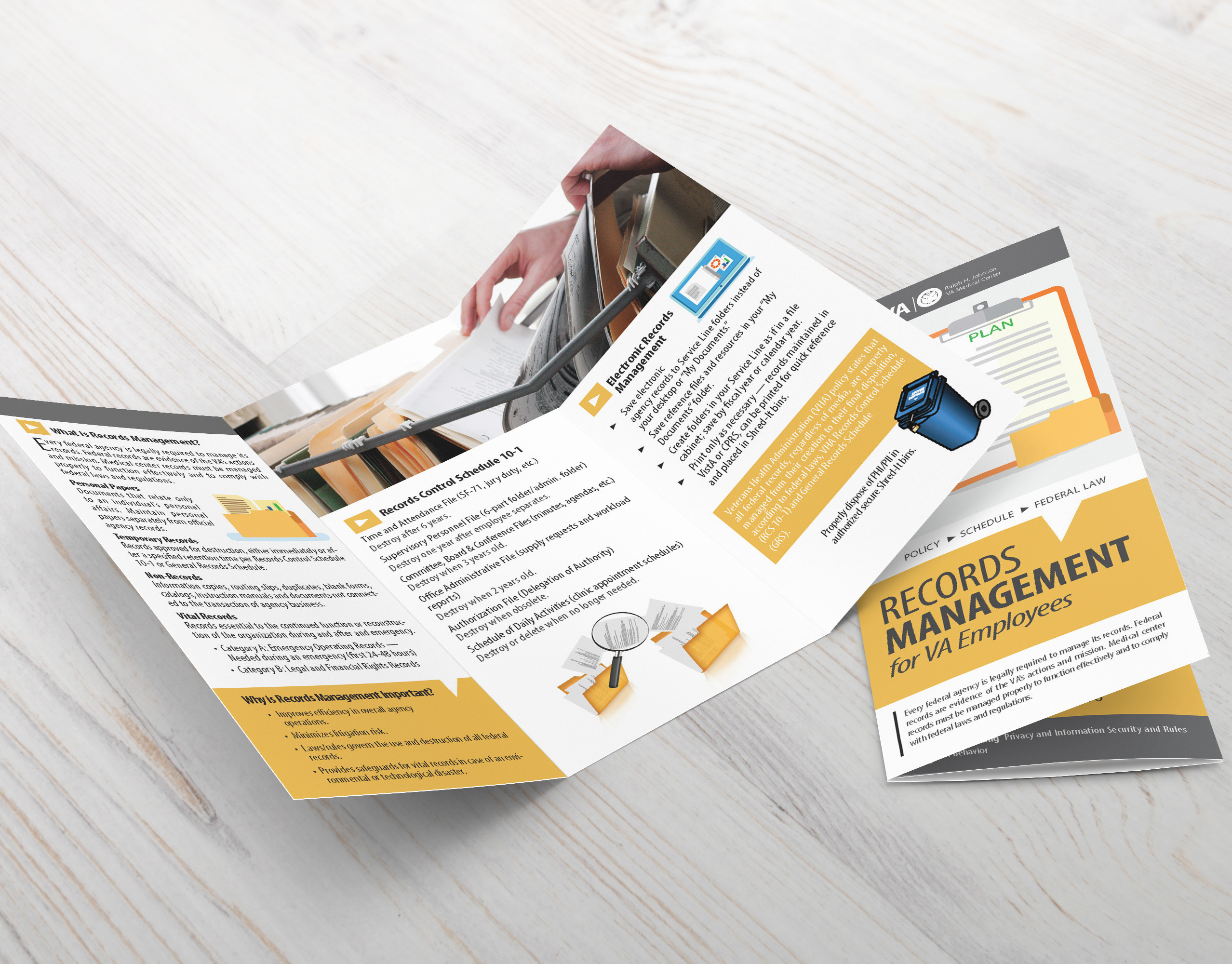
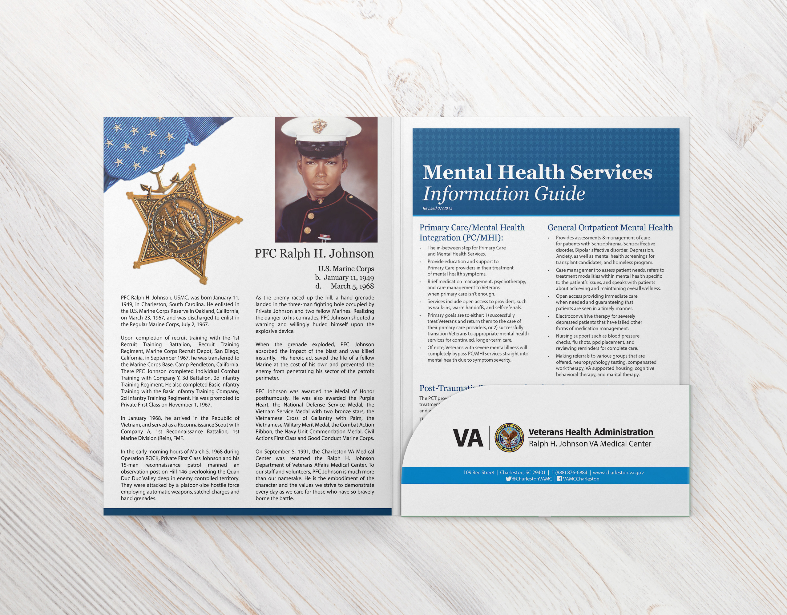
The organization needed a redesigned publication that could present dense healthcare-related content in a way that was visually appealing, easy to navigate, and professionally polished. Much of the material included:
✔ Long-form articles
✔ Research summaries
✔ Data-driven content
✔ Employee spotlights
✔ Program highlights
✔ Institutional messaging
The challenge was to elevate the visual quality of the magazine while maintaining readability and aligning with brand standards.
Project Goals
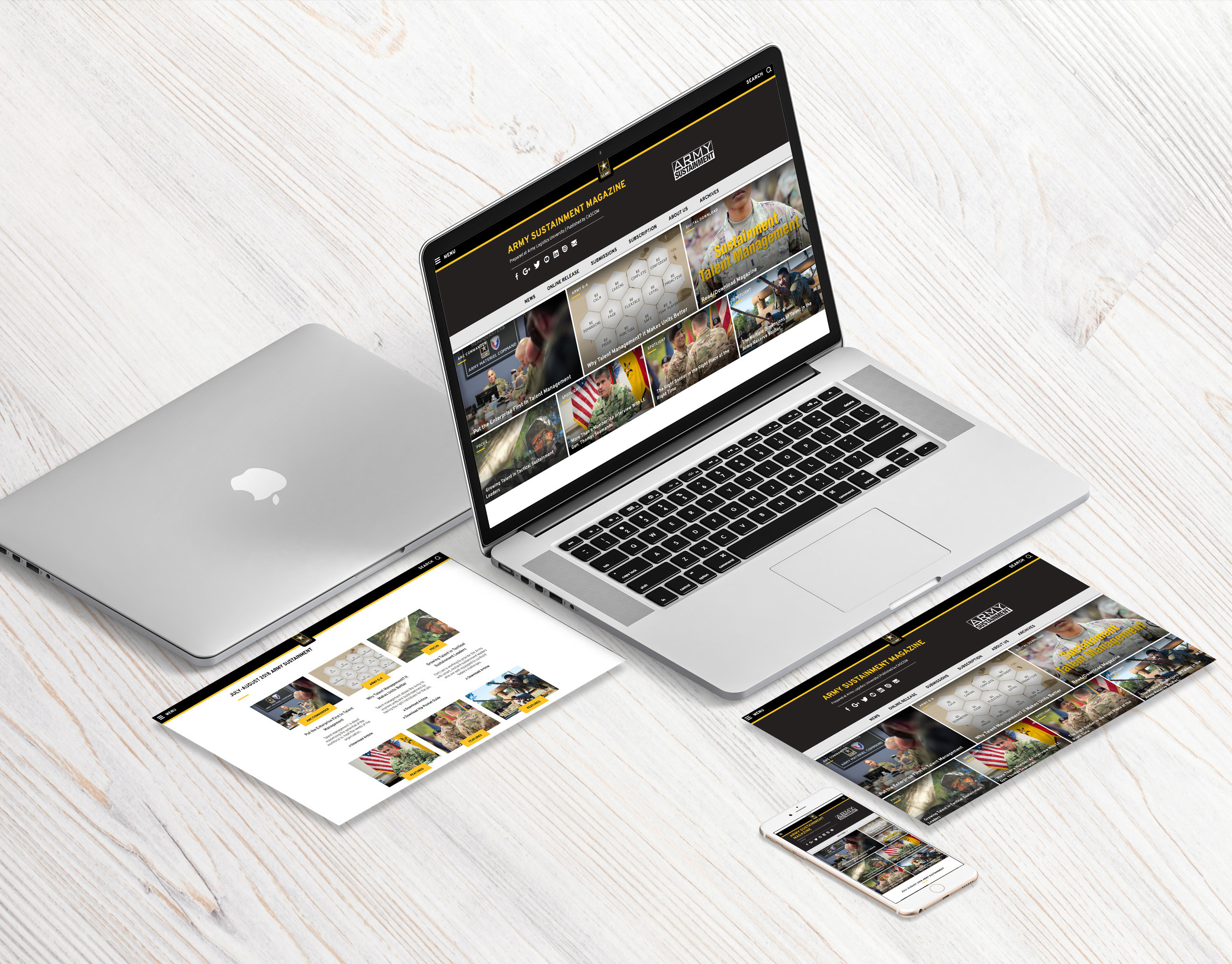
1. Improve readability and navigation across pages, make interactive
2. Modernize the visual identity of the publication
3. Strengthen brand consistency through layout, color, and typography
4. Balance text-heavy content with supporting visuals
5. Create an editorial system usable across multiple issues
2. Modernize the visual identity of the publication
3. Strengthen brand consistency through layout, color, and typography
4. Balance text-heavy content with supporting visuals
5. Create an editorial system usable across multiple issues
My Role
As the primary editorial designer, I handled:
✔ Concept direction and layout structure
✔ Page templates and repeatable design systems
✔ Typography selection and hierarchy
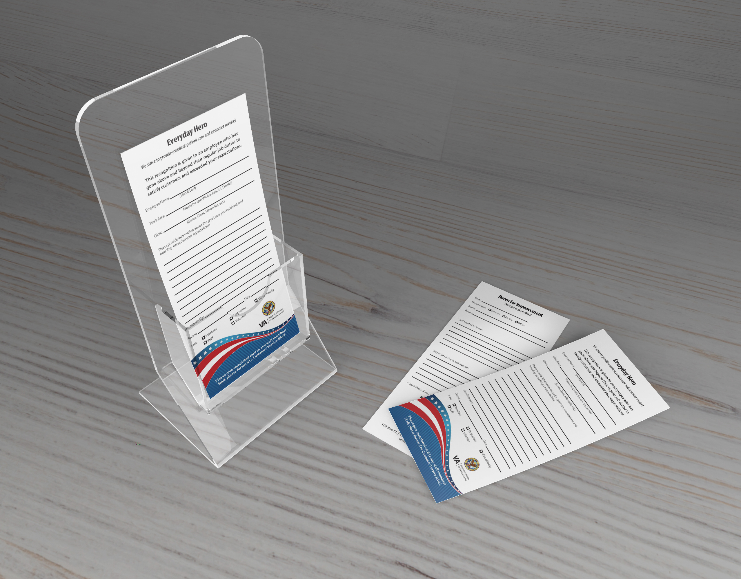
✔ Photo treatments, icons, and visual accents
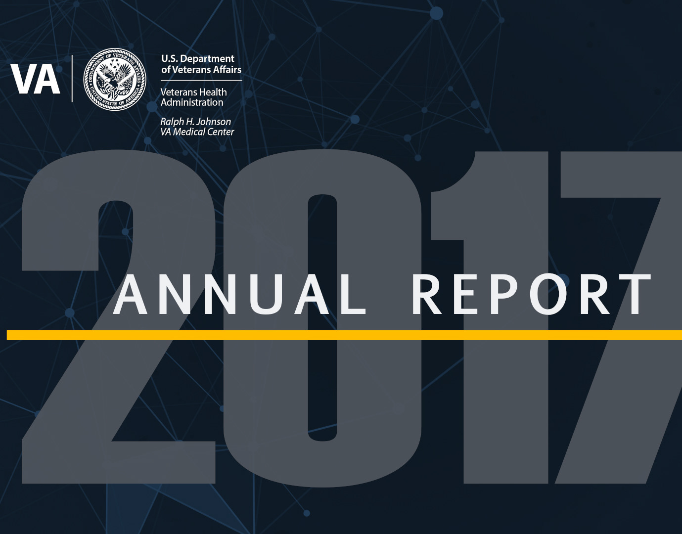
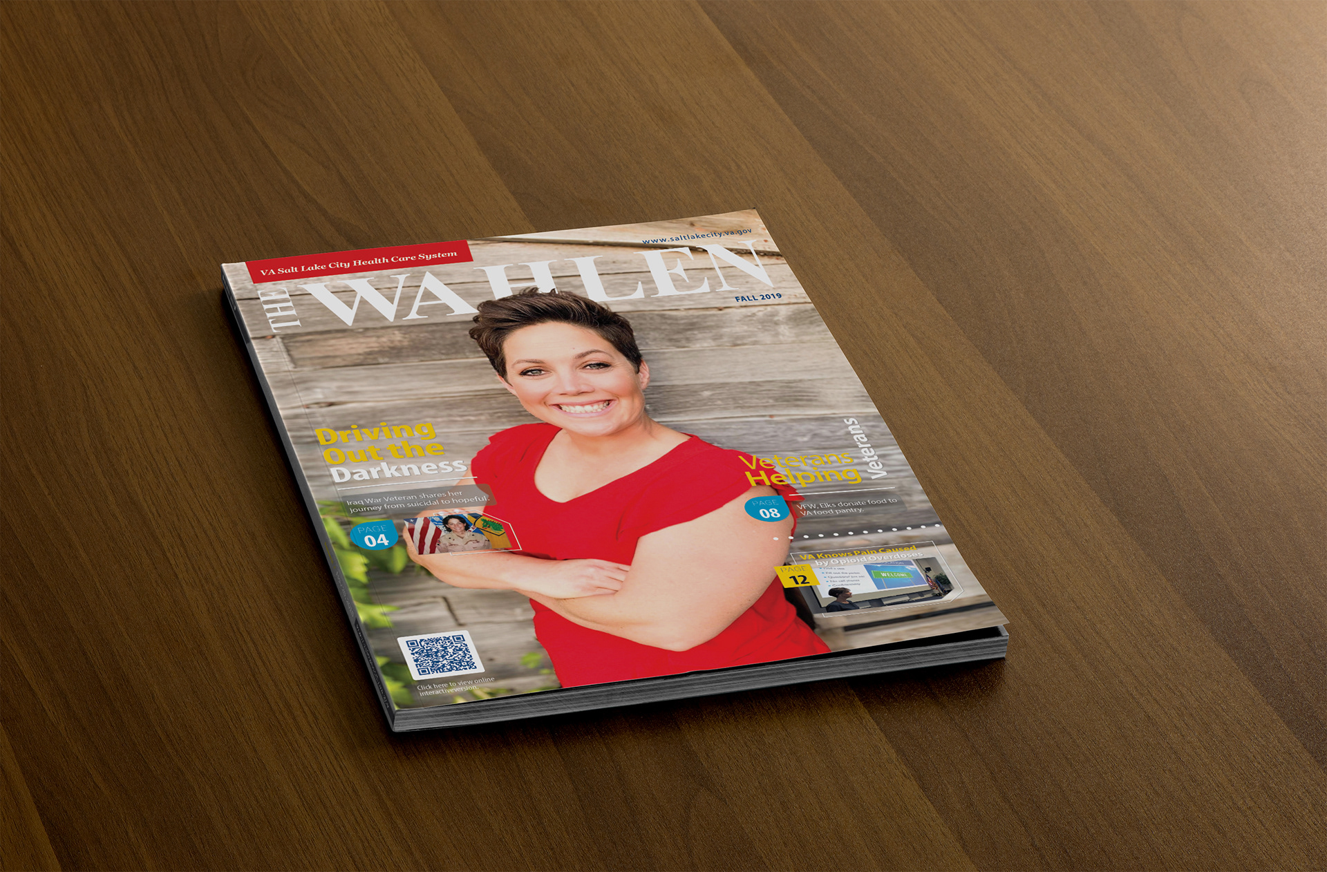
✔ Cover design and section dividers
✔ Final print-ready files and export formatting
This required a blend of visual strategy, editorial design, and production expertise.
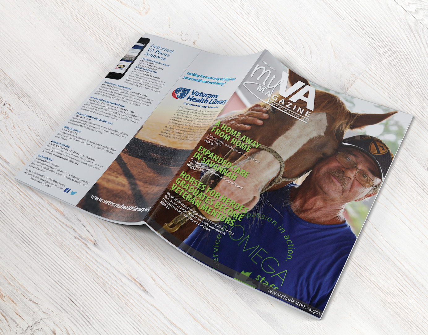
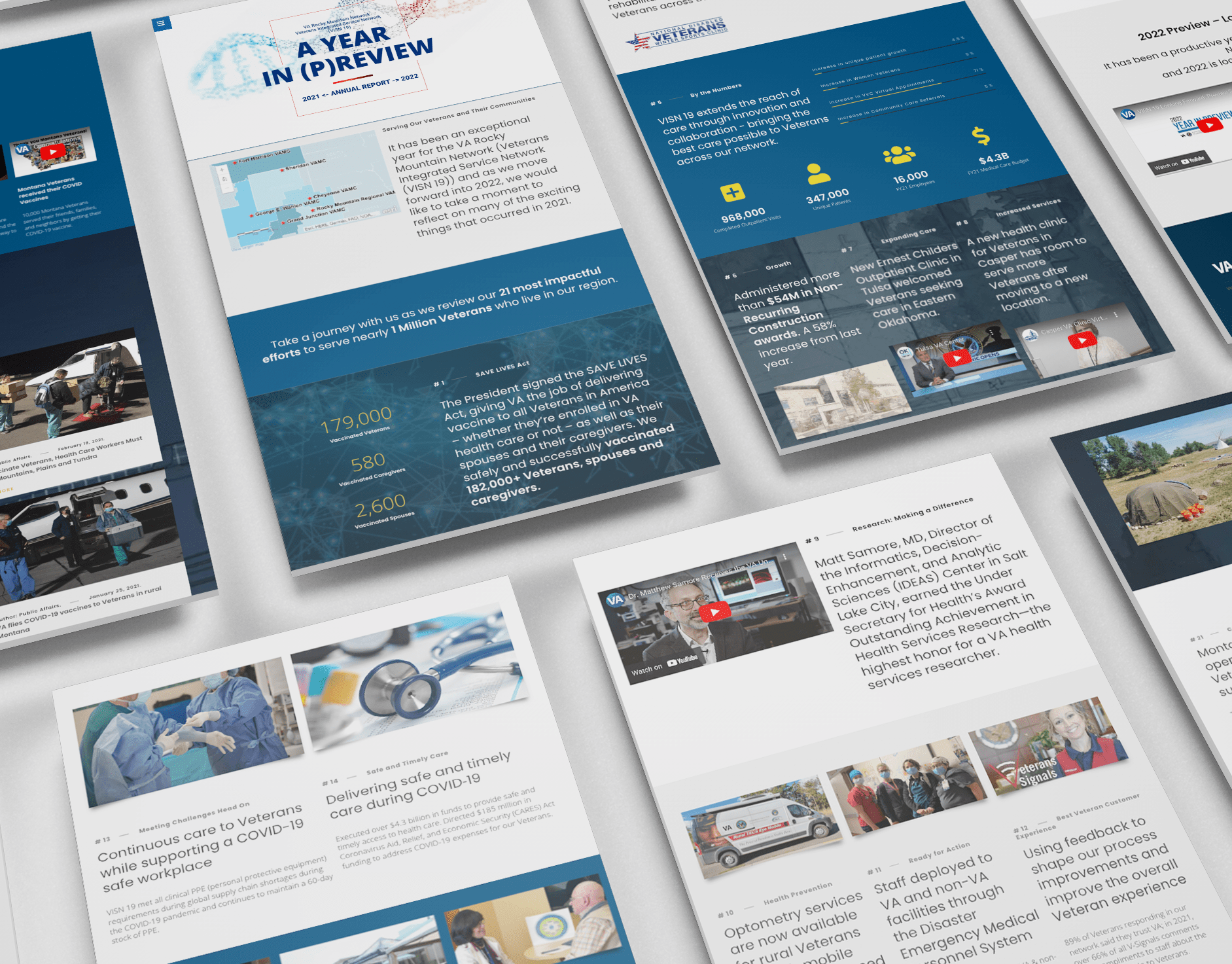
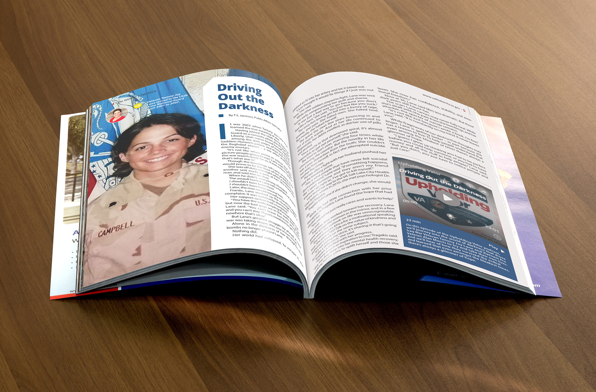
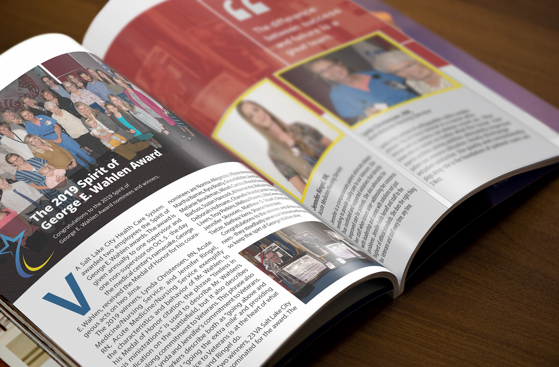
Solution
I created a clean, modern, and flexible editorial layout system that allowed long-form healthcare content to flow naturally while still feeling engaging and visually dynamic.
Design Strategy Highlights
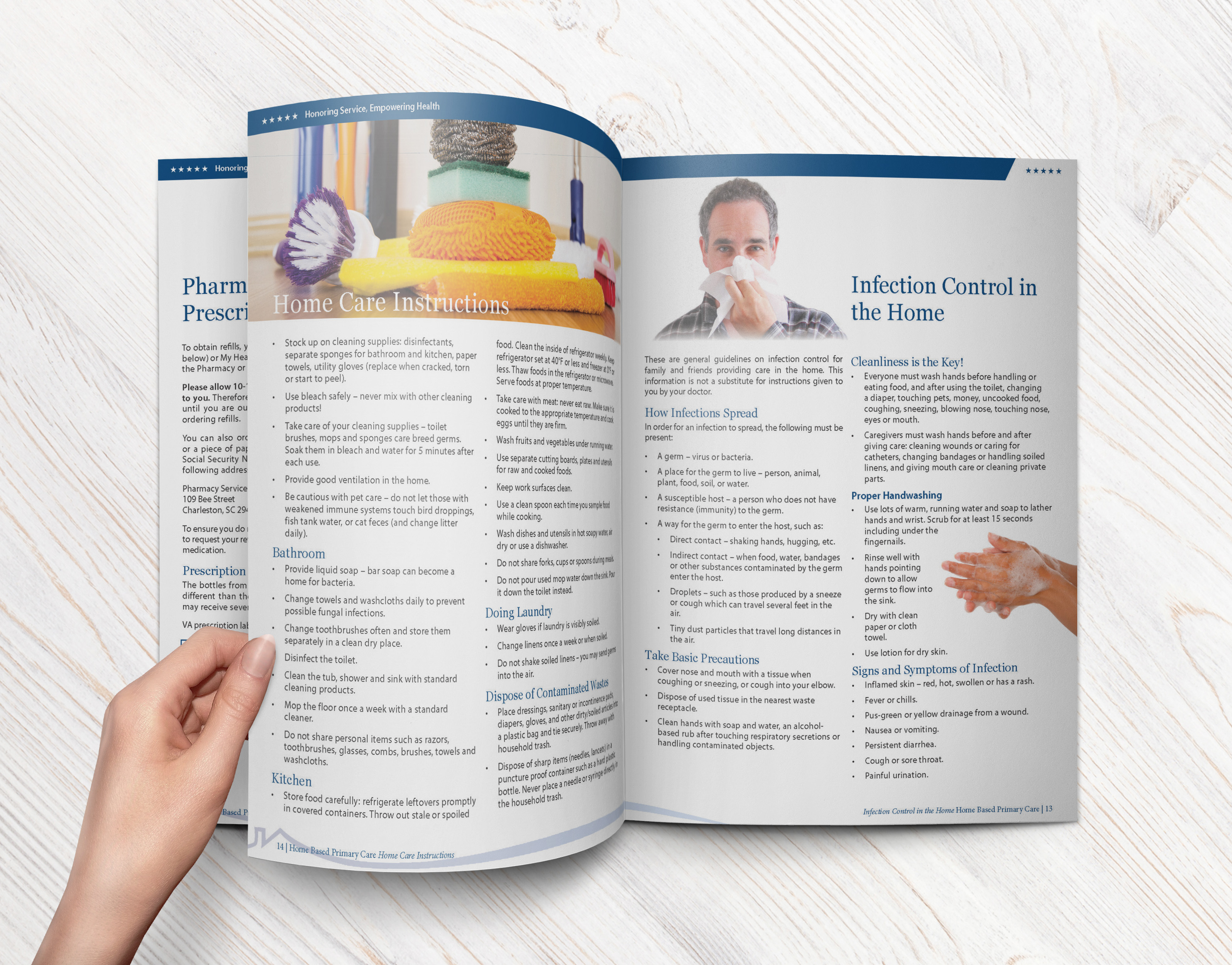
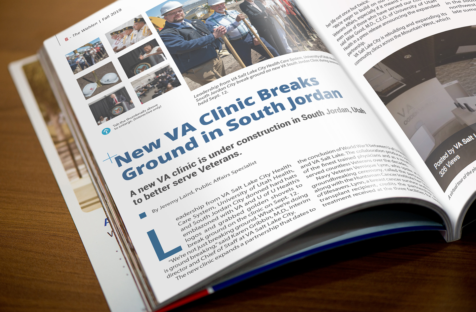
✔ Clear Hierarchy & Readable Typography - Selecting a clean serif/sans-serif pairing increased legibility and gave the magazine a professional, approachable feel.
✔ Grid-Based Layout Structure - A modular grid allowed for variety across pages while maintaining cohesion.
✔ Section Breaks & Visual Anchors - Color blocks, subheadings, and thematic design elements helped guide readers through long-form articles.
✔ Strategic Use of Imagery - Photos and graphics were used to break up text density and add warmth and humanity to healthcare stories.
✔ Consistent Brand Voice - All pages aligned with institutional brand guidelines — reinforcing identity and trust.
Impact
The redesigned publication improved clarity, readability, and visual engagement. Internal stakeholders reported:
✔ Stronger reader engagement
✔ Improved navigation and content flow
✔ A more modern, professional look
✔ Easier updates for future issues using the established layout system
The magazine became a key tool for internal communication and external representation of the organization’s mission and values.
Select Deliverables
1. Full publication layout (cover + interior pages)
2. Editorial design system & grid structure
3. Typography and color style guide
4. Photo selection and styling
5. Print-ready PDF (Interactive) & distribution files